Chapter 3 | Results
In this section we take the variables discussed and compute a series of unsupervised associations. The goal is divide cities into groups or pairs of associations by how the form and feel of the downtowns compare. We peform cluster analysis to establish how common algorithms would partition cities before building a similarity score in a manner related to those of sports analytics.
clusters
Using the variables we selected in the prior section, we begin with separate cluster analyses, beginning with k-means and then moving to agglomerative clustering. With k-means, an algorithm attempts to reduce the variance within clusters after receiving as a parameter the number clusters. By moving the centroids of clusters, observations are sorted into groups by euclidean distance to that centroid across variables. Agglomerative clustering is a form of hierarchical clustering that joins observations to nearest neighbors in multidimensional space, or by joining those observations to nearest agglomerations if they are not closer to an observation than that observation is to another. It computers euclidean distance across variables and agglomerates observations that are similar before moving to those that are less similar. Because we use five variables, the algorithms are attempting to reduce distance across five dimensions. Note that both of these methods are related to the similarity score that we develop below: they use euclidean distance to determine how related observations are. Yet they lack specificity and thus serve as an exploration and sensitivity analysis.
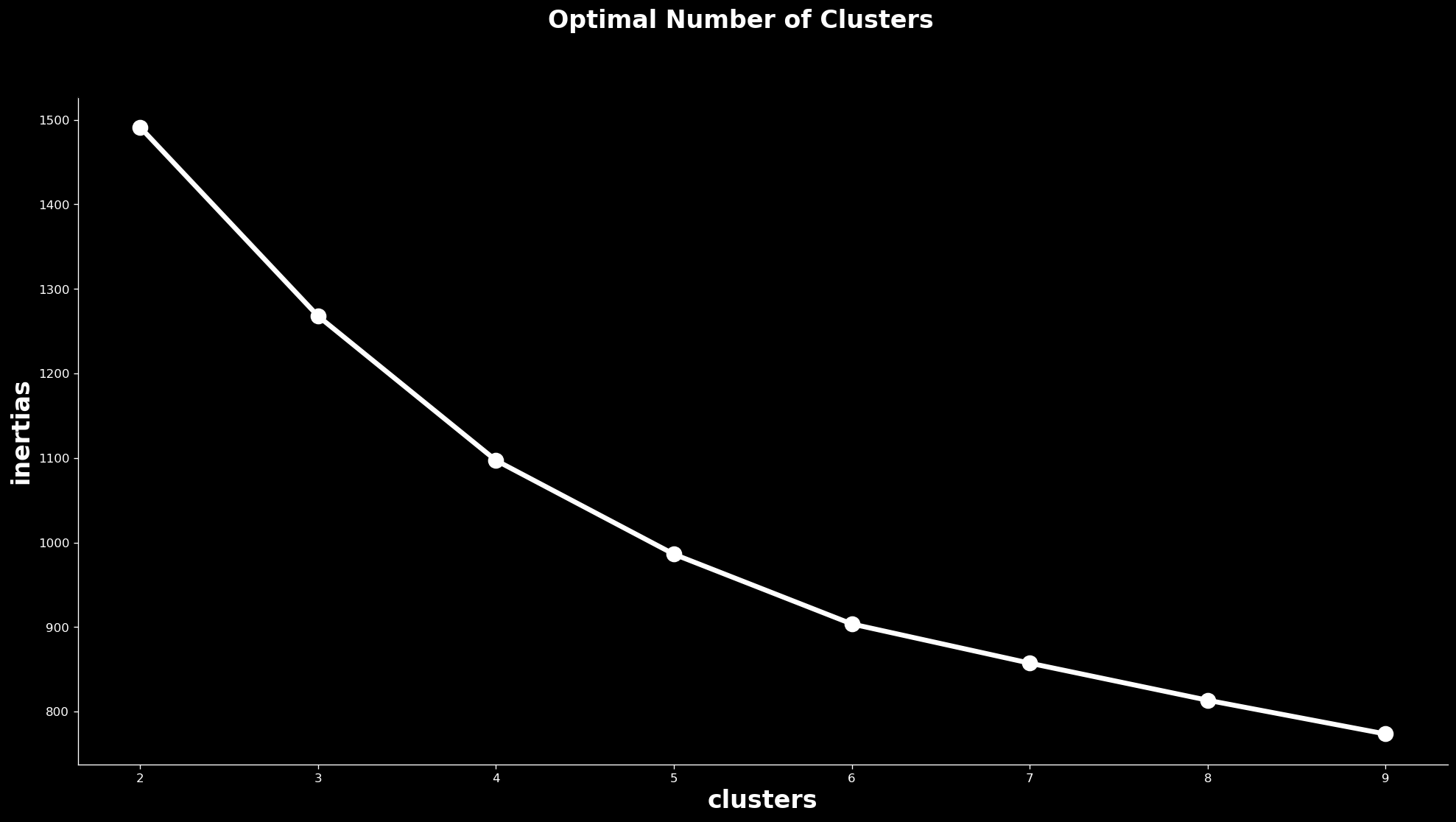
We begin with the k-means algorithm in the sklearn Python library. To select the number of clusters, we use a visual technique that takes the quality of the model on the vertical axis and the number of clusters on the horizontal axis and forces the analyst to determine where the returns to clusters cease to grow. The result is the below plot which shows a steady reduction in error that starts to bend between 5 and 6 clusters. There is not a clear elbow, but the curve is less steep from 6 to 7 clusters as from 5 to 6. We move forward under the assumption that 5 clusters is ideal for this analysis: too many and it will be difficult to build a theory of each category; too few and the categories will lack meaning.
Finding the elbow
This system of determining clusters is forgiving compared to the methods we employ below: Phoenix is in a group with 18 other cities, despite being marginally attached according to the following analysis. It is, however, in a cluster that is small compared to the others, which range from 43 to 116 cities. We also see that, according to these partitions, many of the California cities that surround Los Angeles are similar but Los Angeles itself is closer to New York and Philadelphia.
clusters of cities
To build a foundation for the following scoring system, we use agglomerative clustering, also in sklearn, which uses the same nearest neighbor technique as below to group observations together. This will show which cities are related without giving distance values. This means that we will largely replicate this below, but the dendrogram that this analysis creates helps describe the relationships and is valuable in its own right. Dendrograms provide relative relationships and allow us to see how many degrees of separation link a city.
An urban phylogeny
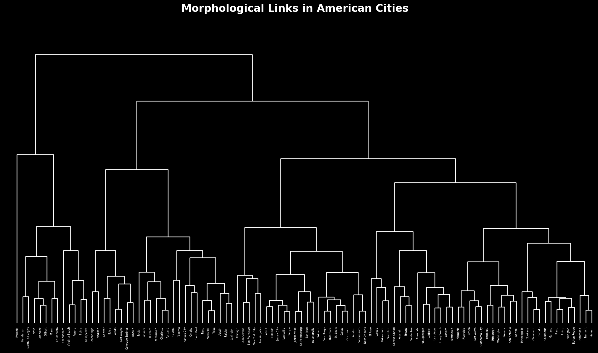
For a larger image, see here. Of note on this dendrogram is that there a section toward its center that includes Philadelphia attached to San Francisco, New York attached to Los Angeles, and Chicago attached to the cluster that holds together all of them: the major cities in America appear to be similar. We also see close ties between Seattle and Tacoma, showing geographic consistency, and while several cities in the South and Southwest are similar, there is not a strong pattern among them.
similarity score
We build a similarity scoring using nearest neighbor analysis with sklearn. To construct this measure we take the euclidean distance across our feature space, scaled it from 0 to 1 and then subtract from 1 so that 0 is the most dissimilar and 1 is the most similar. Every city has a relationship to every other city after this set of calculations, and every city has a similarity score of 1 to itself. This chart contains the 100 largest cities in relation to each other to make it easier to process, and users can zoom to areas of the matrix to see in greater detail. The table below contains every city in our dataset and its three closest cousins.
Matrix of similarity
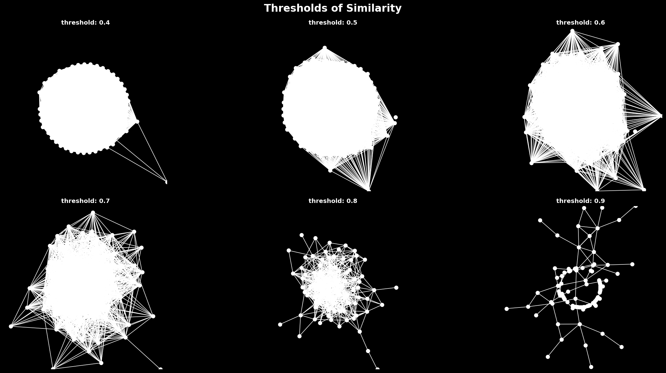
We can construct a network from this information by deciding that any cities with at least an 0.8 similarity score are related. Each node constitutes a city and each edge constitutes a similarity score of 0.8 or more between those nodes. This network shows again that certain cities—like Phoenix—are at the periphery of the network. Below we plot the network, coloring each node by density to show that the center of the graph contains a mix of more and less dense cities. The detached nodes are included to illustrate that not all cities have neighbors within the threshold we have selected, but it is interactive and users can zoom in on the center of the graph. This graph is plotted so that cities with many connections are towards the center and those with few are pushed to the periphery; cities with connections to each other are also closer to each other than those that have no connections to them.
Network of similarity
We can look at this network and see that Fresno is close to Stockon (both in California), Scottsdale is close to Tuscon (Arizona), and Detroit is close to Cleveland (Great Lakes). Geography appears to be a clear driver of spatial configurations in these cities. Some of the most prominant cities—New York, Boston, Philadelphia, Chicago and Los Angeles—have few connections, suggesting that these major cities have a different experience than their satellites. Because this method leaves out cities without close neighbors (though most have them), we also tabulate each city and its three closest neighbors, with no threshold, below. This is closer to the dendrogram, which forces all observations to have some sort of relationship. We also test different thresholds, finding that at each level there are cities on the outside looking in. As we become more stritch about what we consider a relationship, the component that the remaining connected cities form becomes smaller and smaller.
Testing different thresholds
comparison
This method provides benefits above the simple hierarchy by providing details about just how similar downtowns are to each other. That said, it largely recapitulates the dendrogram and comprises the same information. Further, all of these methods appear to find patterns in the data that track with intuition, but because it considers more than just form, some results appear anomolous: cities with different built environments can still be close if they have similar natural environments and populations. As with any unsupervised technique, it may benefit from a ground truth—from survey data or social media—to determine whether or not people agree with the associations it draws. Below we provide each city with its first, second and third cousin: see if you agree or disagree for the cities that you know best.
Tabulating it all
Updated: